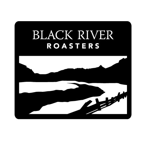
Black River Roasters is a roasting company whose name is derived from the Black River tributary in Vermont.
The logo design was very straightforward: they wanted a black river somehow incorporated in the design.
I felt it appropriate to a simple landscape, incorporating the river itself, but also the mountains and subtleties around the river, such as an old wooden fence. This gave more context to the logo, while giving it a more local feel, as opposed to just an isolated “black river.”

I made several variations on the same theme, using different “frames” that would be useful for different branding scenarios.

The diamond shape had a bit of a “hazard” sign feel so I went through different shapes to frame the landscape.
