knowesys (a play on the word noesis) is a company that specializes in group collaboration consulting, providing insight to companies that need to learn how to work together more effectively to solve complex management problems. In essence, they create synergy.
No, we’re not talking about “synergistic infrastructures” or any other buzzwords.
The logo itself was very simple, and didn’t need any literal interpretation. I used very abstract icons to strengthen the name, although the unique name could easily stand on it’s own right, which is often a strategy employed for companies whose name is short and/or one word.

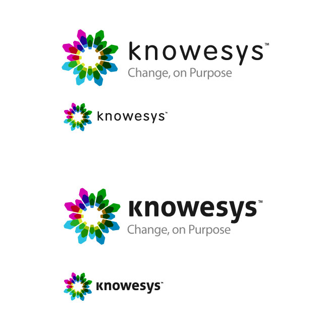
The first design used diamond-esque shapes. They all connect and create a unified icon, similar to the synergy of group collaboration.
While the shape looked very stylish, it was a bit cliched and overly complex.

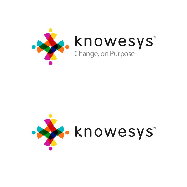
The second design was more colorful and simplified. The shapes were more reminiscent of people, and was more unique. I think this one was my favorite, but I went ahead and made another variation.

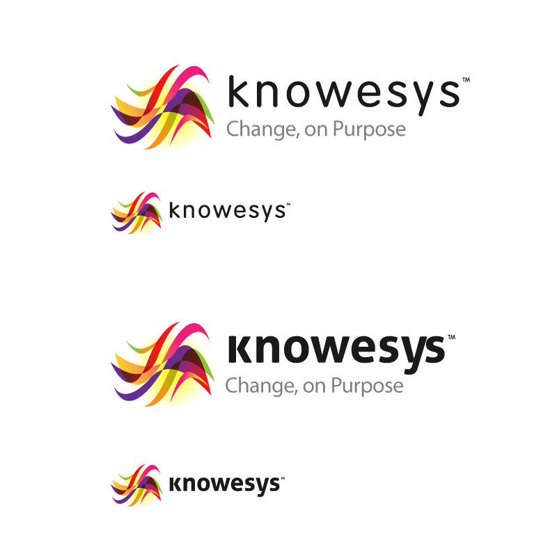
The last design was much more freeform and less symmetrical. However it created a much stronger concept of “synergy” through the energetic flow of the curves. The colorful shapes and overlay were my favorite parts.